Visualizations Matter to How People Make Decisions

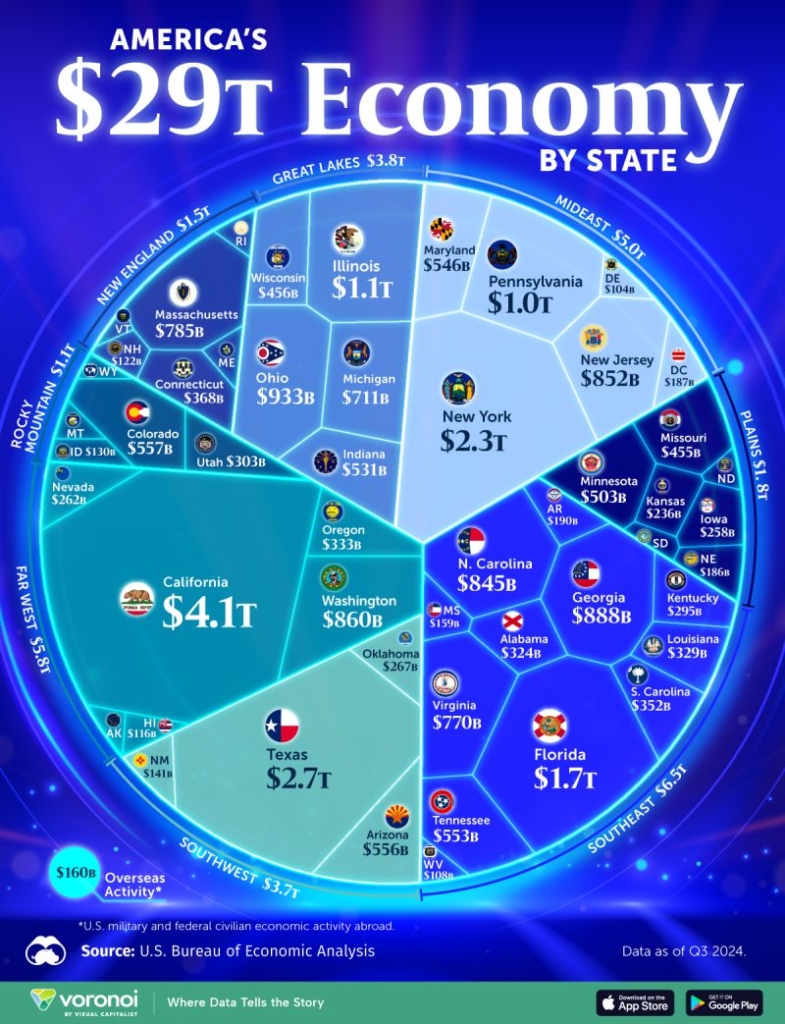
This has to be one of the worst ways to convey this type of dataset that I have ever seen. Here’s why:
I do love how visualization is being used much more commonly to story tell in media and I like the page that posted this quite a lot, but everything that is wrong with a pie chart is put on steroids here.
Pie charts don’t deserve all the hate they get, but are a bad tool for showing anything other than the relative proportion of a small number of buckets. They require the consumer to guess at the relative proportion. “I guess that slice is about half of that other one…?” isn’t a recipe for making an excellent decision based on the data. 40% and 60% are very different. This viz takes that to an extreme by not even having a uniform shape or structure. So now, its even harder to guess how big one state or region is compared to another.
Visualization is the last mile. All that time and money spent on data infrastructure and analysis goes up in smoke if the person making the call has to guess at what is being shown to them. If you want to learn more about how data can reliably drive better business performance, feel free to reach out!
Sign up for our newsletter
Stay up to date with the roadmap progress, announcements and exclusive discounts feel free to sign up with your email.